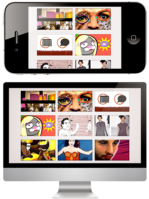
Responsive Web Design
Responsive or adaptive web design refers to web layouts that react to the size of the user's viewport or screen. With an ever changing array of new mobile devices cropping up on the market we have more users to consider than ever before. Sizes vary not only between competitor, but also within a given brand's line of internet ready products. The biggest challenge, while attempting to reach the largest audience, is no longer solely focused on creating applications for phones, but now for larger monitor sizes, Televisions, and tablets.
CSS3 Media Queries are one of the most exciting and usable new technologies web designers have at their fingertips. They are supported by Firefox 3.5+, Opera 9.5+, Safari 3+, Chrome, and Internet Explorer 9+ with a JavaScript workaround openly available IE 5+, Firefox 1+ and Safari 2. CSS3 media queries allow conditional styling based on the width of the user's viewport, and along with percentage based widths, text, and images, lean web apps can be created faster and more cost effectively than ever expected. Squeeze for yourself!